
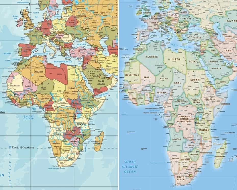
The United Nations General Assembly has backed a resolution encouraging countries to consider using the Equal Earth map projection , reigniting debate over how the world is represented on maps and how those representations shape perceptions of Africa’s size. The resolution received the support of 164 countries , while the United States voted against it. Six countries Serbia, Estonia, Georgia, Lithuania, Moldova and Ukraine abstained. The Equal Earth projection presents continents according to their relative surface areas, offering a more accurate visual comparison of their actual size. Af
The United Nations General Assembly has backed a resolution encouraging countries to consider using the
Equal Earth map projection
, reigniting debate over how the world is represented on maps and how those representations shape perceptions of Africa’s size. The resolution received the support of
164 countries
, while the United States voted against it. Six countries Serbia, Estonia, Georgia, Lithuania, Moldova and Ukraine abstained. The Equal Earth projection presents continents according to their relative surface areas, offering a more accurate visual comparison of their actual size. Africa covers approximately
30.3 million square kilometres
, making it large enough to accommodate the United States, China, India and most of Europe. Yet on the widely used Mercator projection, Africa can appear considerably smaller than it really is, particularly when compared with regions in the Northern Hemisphere.
Why the Mercator map looks different
The Mercator projection was created by Flemish cartographer
Gerardus Mercator
in 1569. It became a global standard, particularly for navigation, because it preserves directions and makes it easier to plot courses across the world's oceans. However, the projection significantly enlarges areas as they move towards the poles. This means countries and regions in the far north appear much larger than their actual land area, while areas closer to the Equator, including much of Africa, appear relatively smaller. Historical maps from Mercator’s work, including maps of Africa published in his atlas between
1595 and 1602
, illustrate the long history of the projection in shaping how the world has been visually represented.
Alternatives to Mercator
Mercator is not the only projection used to represent the world. The
Gall-Peters projection
, introduced in the 1970s, became another prominent alternative because it sought to represent the relative areas of countries and continents more accurately. The
Equal Earth projection
, developed in 2018 by cartographers
Bojan Šavrič, Tom Patterson and Bernhard Jenny
, provides another approach. Its design preserves relative land areas while maintaining a visually balanced representation of the globe. Comparisons between Mercator and Equal Earth maps make the difference particularly clear: Africa appears much larger relative to Europe and other northern regions on Equal Earth. The initiative at the UN was led by
Togo
, with Foreign Minister Robert Dussey stressing the influence maps can have on education, imagination and people's understanding of the world. The UN resolution is
non-binding
. It does not ban the Mercator projection or require countries to abandon it. Instead, it encourages greater consideration of map projections that provide a more accurate representation of the relative size of continents. For Africa, the debate goes beyond cartography. It also highlights how a familiar image of the world can influence people's understanding of the continent's geographical scale and why looking at Africa through a different map can offer a strikingly different perspective.
Comments (2)
Interesting angle. Any data on how this compares to last year?
Thank you for reading and for joining the conversation.
Interesting angle. Any data on how this compares to last year?